Ranked: LSU Football's Alternate Uniforms
- Oct 25, 2024
- 5 min read
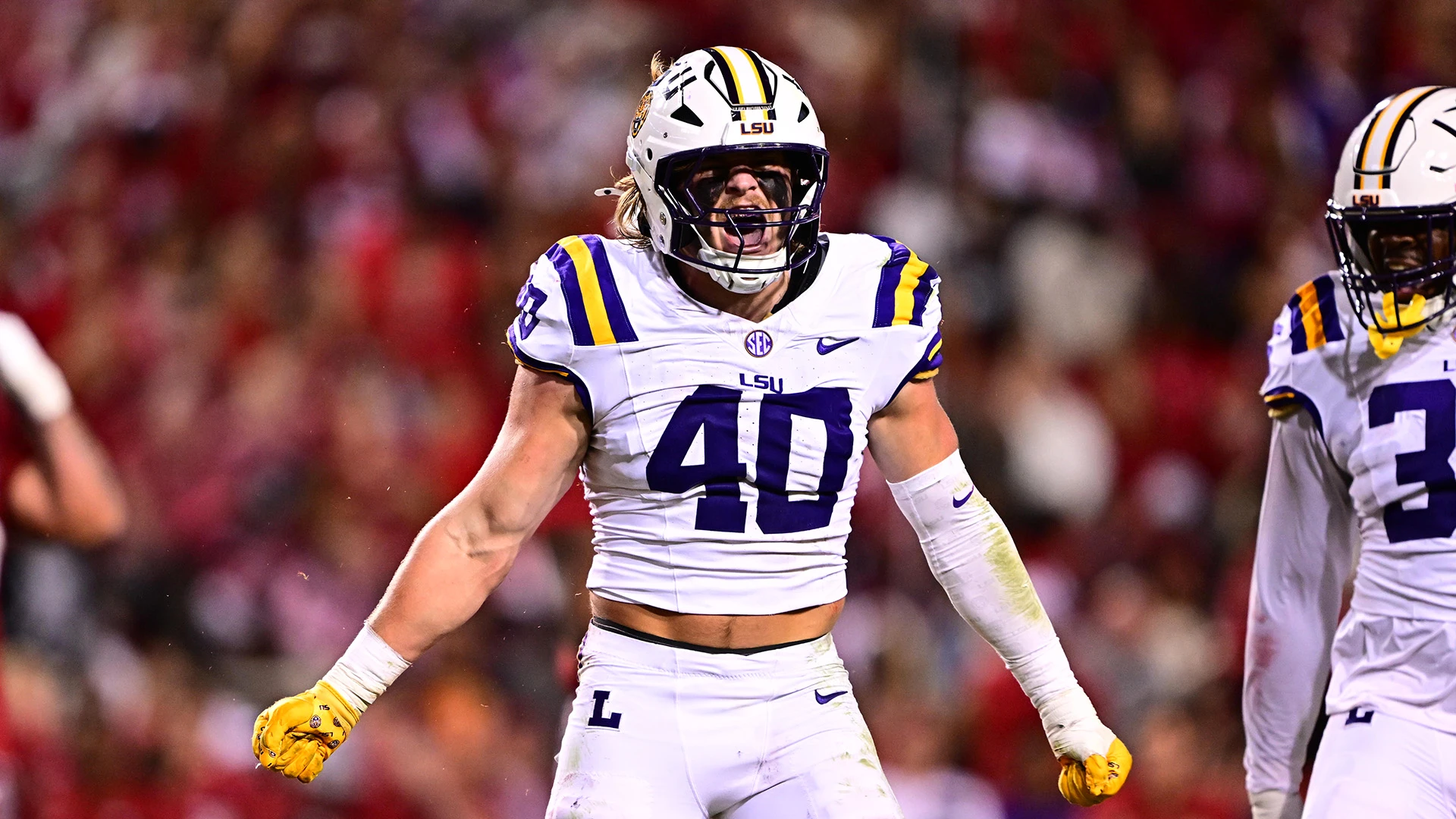
Since 2007, LSU has worn a wide range of alternate uniforms. Some are fresh out of Nike’s kitchen, while the primary repeaters are what’s left in the closet that can be switched around. The debate between sticking to tradition and embracing a shift away from it is changing. Since 2019, LSU has been more reluctant to be different, such as the debut of the white pants paired with the white jersey and the iconic gold helmet combination in the 2023 Army game. This is the perfect moment for me to share my rankings, but provide a more thorough analysis than others, possibly changing your perspective.

Ranking Rubric:
A good ranking hinges on how UNIFORM the uniform is. A strong helmet can tie an entire uniform together, while any element that feels out of place can kill the overall look. I want to keep an open mind and imagine these uniforms on the same template. What looked poor on mesh in the 90s might shine in today’s designs. I’m focusing on good color combinations, decals or patches, the typeface for names and numbers, and the presence or absence of stripes. As for pants, LSU has established that they don’t need to match the jersey. That alone will foreshadow my decision on the rankings.
Honorable Mentions:
All White, 1997 Gold Jersey, Gold-Whites:
Good start, huh? Yes, the All-White will not make the top 5, and it’s all down to say it with me! THE STRIPES DON’T MATCH! They also don’t match with the purple jersey, but the purple balances out the white enough for it not to be such a bother. The white is overwhelming, and the simple fix of matching the striping would improve this uniform.
Now, out of the 1996-1998 gold jersey experiment. The 97’ one is the best and would translate very well today. The purple drop shadow from the number does well at color balance, making it stand out. This is an example of how a suitable typeface can help. 96’ was white over yellow, making the jersey feel flat. It looked more like a practice jersey. 98’ repeats the athletic drop shadow but inverses the color purple with a white shadow. It gives it a negative color filter effect; look up an inverted photo. The gold jerseys happened in the wrong era. Since it’s a new combination, the Gold, White, and White is another example of ruined by the helmet and pant stripes not matching. It’s really nice, just not Top 5.
5 | 2011 Nike Pro-Combat |

I, for one, think this uniform is perfect. Many have issues with stripes extending into this bulky armpit section. It’s necessary to know how far they extend. If you recall, in late 2012, LSU started using this exact Pro Combat template. The stitching forced the striping past the collar. The best part is the dark purple and old gold, making this uniform rich, honoring the Chinese Bandits in the 1950s. Adding the tiger stripe pattern within the numbers and the faint stripes on the top of the helmet are great touches. I’m very 50/50 on the helmet cause the stripes were too thick; it seems more like camo. The helmet could do without the tiger pattern and still hit the same. This is the one uniform LSU fans should appreciate due to the colors.
4 | 2016 Gridiron Gold |

Gridiron Gold is one of the best LSU jerseys of all time—vintage gold with sleeve stripes and numbers from the 1940’s. I’ve mentioned how a typeface can help. I love an excellent notched, slabbed collegiate font with blocked ends, especially for the 2, 5, and 7. Add your boy Sailor Mike on the collar, and you have a banger of a jersey. Pants with the Letterman “L” increase their look. Here’s the kicker: the helmet is bad. The helmet is the reason this kit sits at 4. I think the gold chrome is the only nice part of the helmet. Numbers honoring the 50’s-70’s helmets fall flat. I’m unsure how well matching the jersey numbers would’ve done. Using different designs from different eras becomes a typical theme in LSU’s alternates. It leads to good helmets, bad jerseys, and vice versa. Stop calling this “mustard”; honey mustard is more respectable, and Old Gold is perfect.
3 | White/Purple/White |

“But the stripes don’t match!” Yeah, but they kind of do. All striping follows the purple, gold, and white on the inside. Of course, the color of the jersey doesn’t count toward being part of the shoulder stripes. Too deep? Purple does become so dominant that the helmet/pant stripes become one with the jersey. This uniform is the inverse of the traditional look and the perfect way to fill in the need to see the purple jersey. We can thank the 2007 Hurricane Relief game for this combo. I would add those here as well; the only difference was the, let’s call them, clavicle stripes. In 2019, we wore them back-to-back, so it’s a fan-favorite and loved by the players.
2 | 2018 Silent Season |

The discussion around this one-of-a-kind uniform always ignores the insane detail of the jersey and pants. This uniform honors two of my favorite things: military history and trees. Honoring the “Silent Season” of 1918, when the program didn’t play a game due to World War I, 30 live oak trees were planted in Memorial Oak Grove, with one additional tree dedicated to “The Unknown” in honor of those who died during the war. I freaking love the number font and how it’s styled to match the Grotesque typefaces of the early 1900s and filled along with the collar and pant stripes with the incredible oak leaf pattern—again, repeating the use of rich dark purple with a great mix of other purples. I’d rank the jersey alone as one of the best jerseys Nike has ever done. The famous color-changing helmet! The special iridescent paint shifting the color from purple to gold was insane. It looked incredible as the sun was setting over Death Valley. My issue is the decals. I think it could’ve done without the stripe, to be honest. Even the white letters of LSU should’ve been vintage gold or iridescent gold. It takes away from the “French Armor” look they were also going for, which matches the military theme in the kit. Putting this at 2 hurts my soul.
1 | 2009 Nike Pro Combat - Cochan de lait |

LSU was blessed with a gem for their first Pro Combat kit in 2009. “Pig Roast” has all the elements that made the Gridiron Gold and Silent Season good. The sleeve striping from the 40s and vintage gold helmet mimicking the 40s as well. The only issue is the pant striping, which reflected the white pants we know today. Yet they didn’t start until where a pocket would go; the side of the stripe closer to the back legs curved out to wrap to the back leg. The simplicity of the number gives it a clean look. I’m going to call it a throwback. Any article on the uniform mentions lightweight material and does not talk much about visual design. It’s best to alternate uniform when considering the Ole War Skule, the history of LSU’s football legacy, and our love for tradition at LSU. At some point, I would like to see a combination of these jerseys and the Gridiron Golds.
Best LSU Alternate of all time?
All-White
2018 Silent Season
2009 Pig Roast
2011 Pro Combat


